Follow-ups to merged PR #8734 · August 30, 2026
Composer follow-ups, before and after
Seven fixes retained; changes 4 and 6 have been reverted. The original numbering is preserved below. All after images and recordings have been refreshed from the current branch. Click any image for the full-size version. Keyboard and pointer recordings are included where a still image is not enough.
Before: merged main 30175a8af04. After: 558f3584a8 on fix/composer-banner-review-followups. Screenshots use scripted data, with no live requests or updates.
The working timer stays in the timeline. Tasks stay in the composer. Loading still hides tasks. Stash remains a separate tab and never moves into the footer.
1. Loading stays visible
Loading and Monitoring were both classed as activity. Monitoring came first, so it could hide the loading status. The composer's loading or syncing status now stays attached, with Monitoring behind it. Tasks still stay hidden while loading.
beforeMonitoring hid the loading status.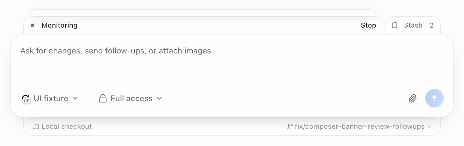 afterLoading remains attached; Monitoring peeks behind.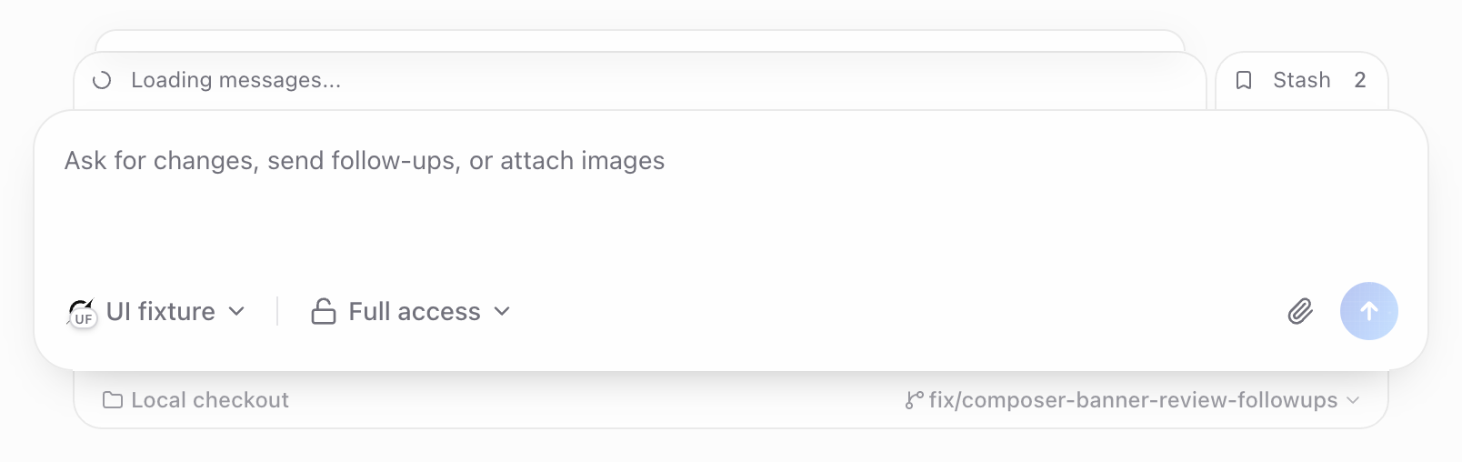
2. Keyboard focus stays visible
Previously, tabbing to the peek immediately expanded the stack and made the focused button invisible. Now Tab focuses the visible peek. Enter or Space opens the stack and moves focus to its first control. Escape closes it and returns focus to the peek.
beforeAfter Tab: the stack opened, but focus was invisible.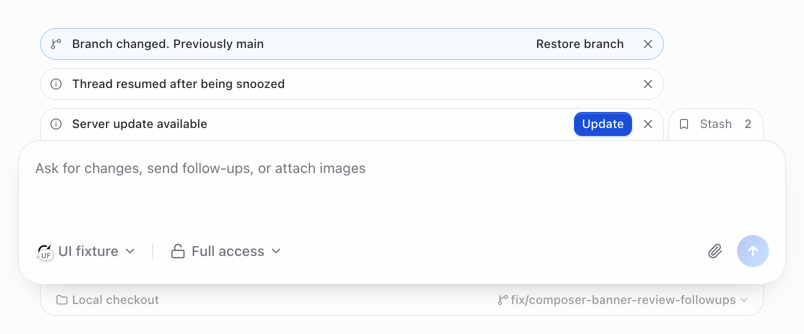 afterAfter the same Tab: a visible focus ring on the peek.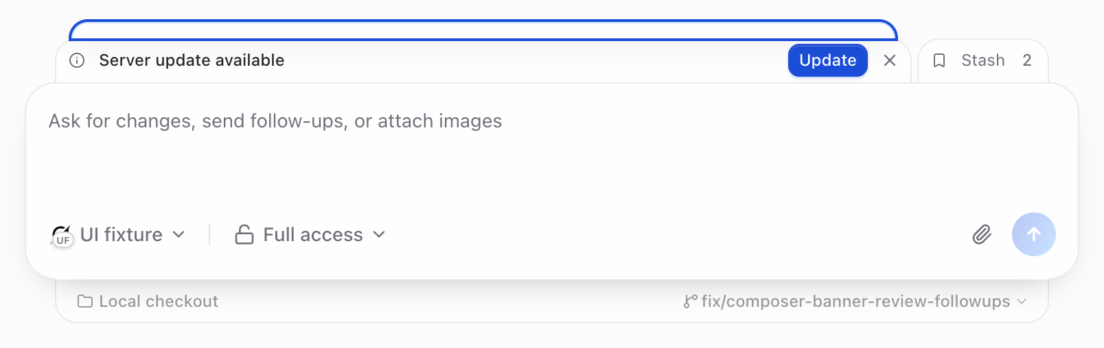
Watch the interaction
Start at the update notice's dismiss button, then Tab → Enter → Tab → Escape. Watch where the focus ring goes.
beforeInteraction recordingafterInteraction recording
3. Question options keep their focus ring
The last option touched the right and bottom edges of a clipped panel, cutting off its focus ring. A 4px inset now leaves room for the whole ring. These images show the last option focused with the keyboard.
beforeThe right and bottom of the focus ring were clipped.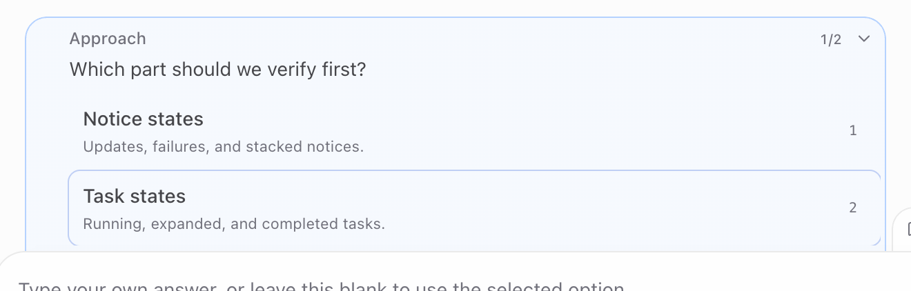 afterThe ring is visible on all four sides.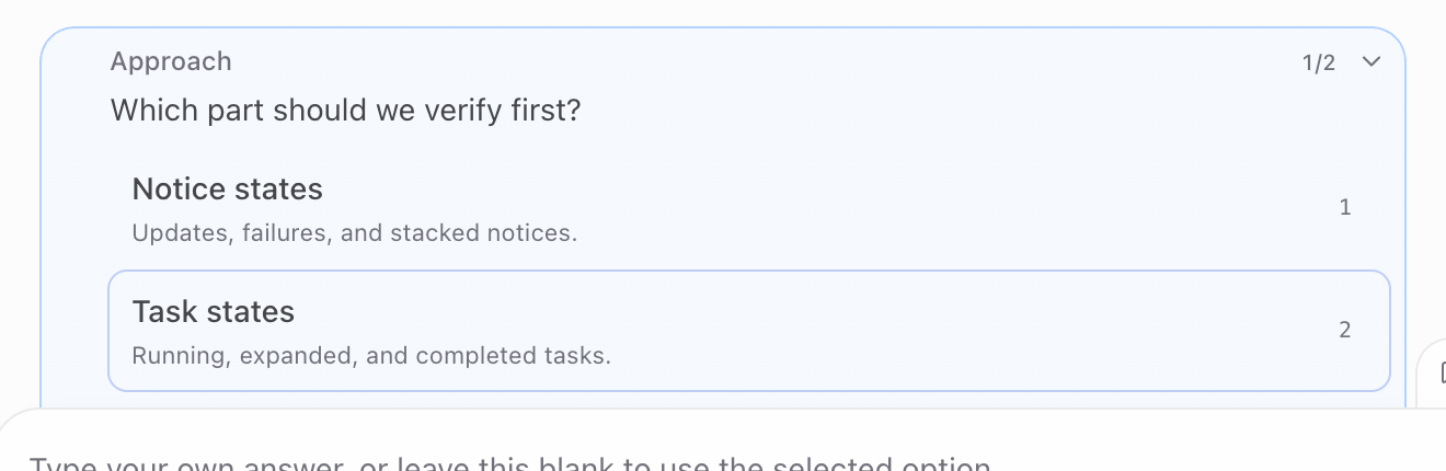
4. Reverted: notice actions beside the title
The alignment change has been reverted. The description is back on its own row, and actions sit beside the title. Both images now show the original layout; the after image is a fresh capture of the current branch.
beforeOriginal layout: Reconnect beside the title.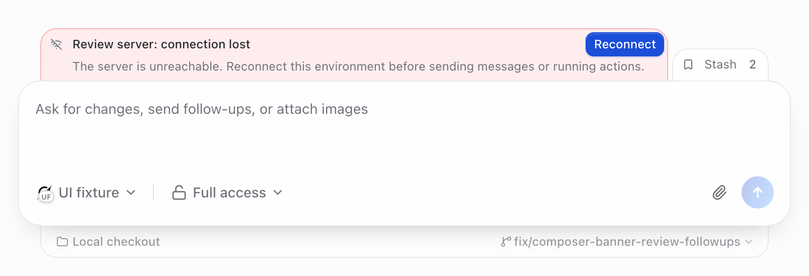 afterReverted: Reconnect beside the title again.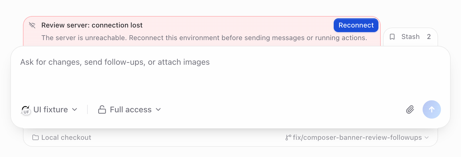
7. The decorative chevron has no extra hit area
The chevron borrowed button styling, including a 44px touch hit area extending below its header. That decorative element now ignores pointer events. These screenshots use a precise click 4px below the header with touch sizing enabled. The red ring in the recording marks the click.
beforeClicking below the header closed the question.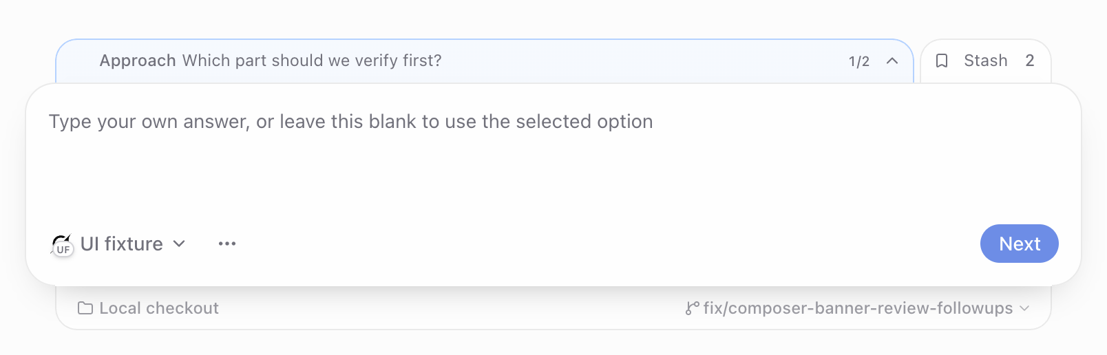 afterThe same click leaves the question open.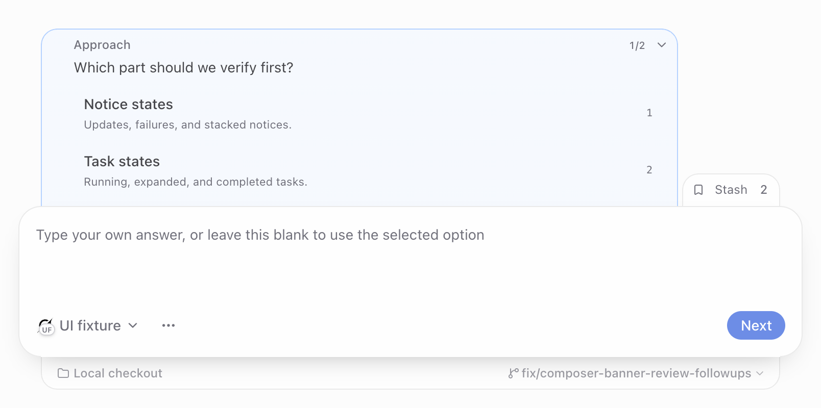
Watch the interaction
A precise click below the chevron with touch sizing enabled. The ring marks the actual click coordinate. Browser finger-tap snapping is separate from this CSS hit area.
beforeInteraction recordingafterInteraction recording
Native touch was also tested for opening the notice stack. For this overlap test, precise clicks isolate the CSS hit area; Chromium may still snap an imprecise finger tap to a nearby control.